Friday, 7 August 2015

A new way to approach graffiti

I was incredibly focused on the idea of graffiti being on a wall, so I tried to move away from that taking inspiration from various canvas graffiti and comic artists to come up with this illustration.
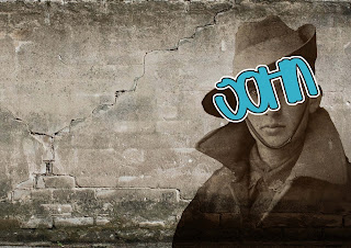
The colours and imagery are striking and bold, but they don't really portray the message I want. Also I could not for the life of me figure out how to incorporate typography into this. It just did not work.
This is quite frankly the best result of incorporating some type into the image and it really doesn't look great. Back to the drawing board again.

Tuesday, 4 August 2015

Working with typography

I used one of my early Anzac concepts in an exercise with type, seeing how different fonts, sizes, words and layouts could work on the page.
I know that type is my weak point and I think this exploration page has been helpful and will serve me well in this assignment and the future.
I have experimented with all kinds on this page in terms of size, colour, boldness, lower and upper case, as well as the words themselves and their placement on the page. Playing with the balance between image and type has been a good experience.

Sunday, 2 August 2015

Going ham on the graffiti concept

I fleshed out a bunch of different ways I could graffiti over the Anzac soldier's face.


In the end I was aware that the solider photo could only be a placeholder for so long, so I illustrated the soldier using the original image as reference. However I soon discovered that this didn't have the same emotional impact as the photo, so it was back to the drawing board.

A quick idea

I wanted to parody a scene from Batman comics where the Joker stands ominously over Robin after having beaten him with a crowbar.
In a twisted way I was drawing parallels between this idea and the idea of John beating the crap out of a soldier for the sake of a new flag.
I quickly saw however that this idea could be misconstrued, as well as the reference being too obscure for those who don't read comics.
I'm scrapping this idea but it was good to explore how far I could swing this.

Wednesday, 29 July 2015

Desecrate our History

I settled down with the idea that changing the flag was essentially desecrating our history. Specifically I would use the ANZAC soldiers to invoke a sense of Wehi. How could you want to change the very flag the fought for? Was their sacrifice worthless to you?
I somewhat wanted to put people on a guilt trip, but also open their eyes to the further smaller consequences of doing something so simple as changing our national flag.
I went through some incredibly rough sketches in my workbook and then some more rough digital thumb-nailing, temporarily pulling some images in and fusing it with my own digital drawing to get my message across.
I really liked the idea of putting graffiti over ANZAC soldiers or statues of them in order to symbolize the disrespect towards our own history.

Though these ideas are incredibly rough they should be able to give me a way forward onto better compositions.

Tuesday, 28 July 2015

Initial digital concepts.

After some heavy thumb-nailing and conceptualizing on paper, I took my ideas to some fairly detailed digital concepts, which I brought to the first interim.
My initial idea was very strongly influenced by communist propaganda posters. The colours and imagery are very reminiscent of the style. I wanted to incorporate John Key in some way, give the viewers of the poster a visible villain. I later discovered that this would be too literal for what I needed.

The next idea was an issue that made me choose the anti flag side in the first place. The amount of money spent on the flag change could do so much good in New Zealand, and my initial focus in my physical thumbnails was on kids starving (though that too was too literal). I wanted to symbolize childhood, and the money that could be going to it taken away, and so I used the alphabet as a recognizable symbol, and a suited hand about to pick one up.

 Perhaps my strongest example form my initial digital explorations, as a an illustrator this idea immediately connected with me because of how I could use me skills to further develop it. I also really enjoyed the idea of John desecrating this sacred thing, I thought that was something that invoked a lot of Wehi. The Flag we have is the same that our ANZAC troops fought for, the idea of changing it and disrespecting that history that we should be holding dearly was an idea that actually sickened me. I found myself more invested in this idea emotionally than the others, which is why I think I am going to pursue it.

The last idea which I was also invested in because of my illustrative background, was the idea of John pulling off his face (the current flag) to reveal a face beneath, tearing and wrecking his initial identity as he pulled. The face beneath has a blank eye to further enforce the idea of a lack of identity. Overall however I feel this idea gets slightly confused in itself. 

Friday, 24 July 2015

A look into communist propaganda posters. Visually they are incredibly striking and demand attention. Using oranges and reds in contrast with off whites and yellows to invoke a sense of action, alongside heavy focus on the imagery and the way that they are presented in terms of perspective. The designers behind these pieces of propaganda were true masters of their craft.
I think this style could be applied to a poster concept so as to instill a sense of revolution against the flag change.